

Brand evolution
PedidosYa changed its strategy to a more expansive, massive, broad, open, and spontaneous one. The company changed its message and its business model. This is the process we followed to support this cultural, communication, and visual evolution. The simplest part? A holistic change in its visual identity. The most difficult part? Changing the mental model of all of us who work there and the one we've associated with the company since its inception.

Multiverticality
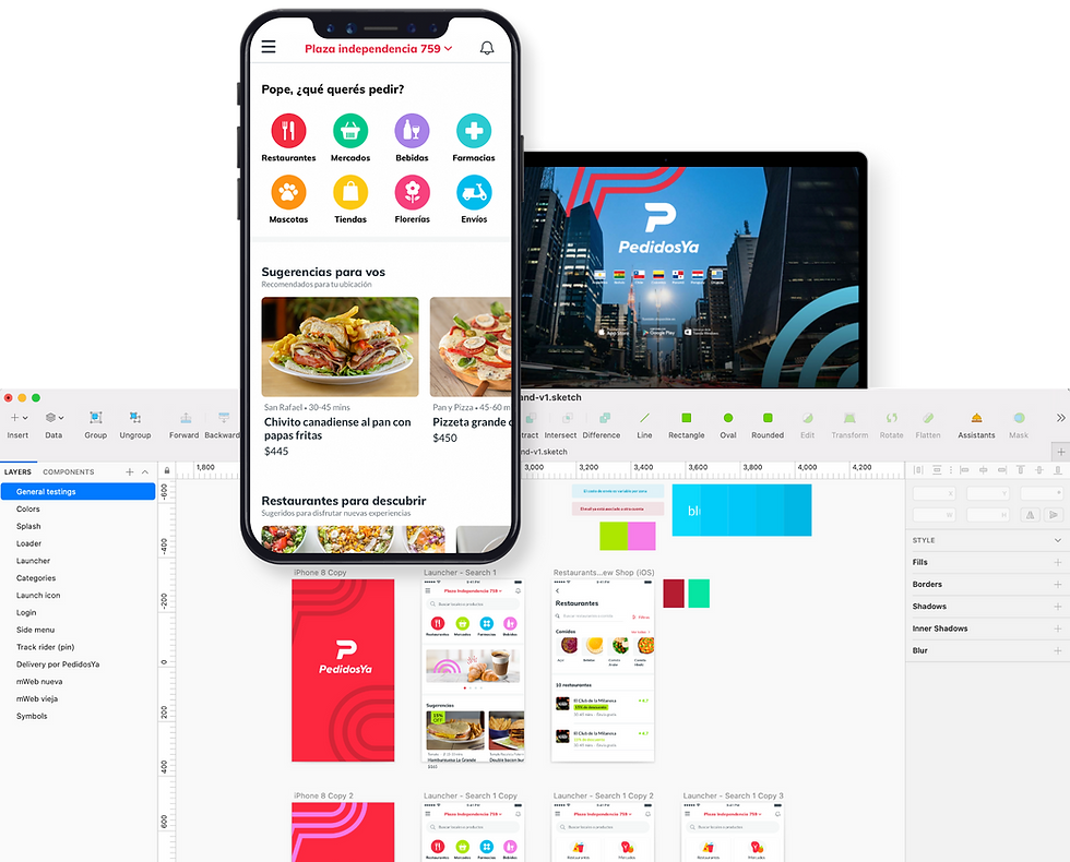
PedidosYa's business model changed. For nine years, it was a food delivery company, but it grew rapidly, scaling up and expanding its business. It became a multi-vertical company, meaning you could order not only food but also groceries from the supermarket, prescriptions from the pharmacy, flowers, or even send your house keys to a friend. We wanted people to use the app for whatever they needed, anytime, anywhere.
With this new status, the brand and its communications needed to be redefined. A clear example: the logotype of a P with a counterpoint of a fork no longer had a purpose. Therefore, we decided to undertake, as we call it internally, a brand evolution of the brand. This involved, in addition to a new logotype, a change in the business mindset (and, consequently, of the user and the public), in communication, and in positioning.
For strategic and business reasons, the brand evolution development process was initially carried out by DeliveryHero (the German company that owns PedidosYa), through research with us. They proposed ideas, and together we defined and refined the brand's evolution. This process took about three months of teamwork between Uruguay, Argentina, and Germany.
The big challenge was applying brand evolution to all platforms, campaigns, pieces, or elements where PedidosYa was present. Why was this a problem? Once we completed the final documentation we created collaboratively, we had just two weeks to complete everything cross-company (the date was June 14th, I'll never forget it :)
Patterns
A new resource we implemented from a visual identity perspective was patterns. These are the branding device that allows us to be consistent across marketing and product channels and establish a distinctive identity across all our touchpoints. They are elements based on organic geometric elements rooted in the letters of our logo.
We named each shape to make it easy to remember and identify, and we categorized them based on the number of elements each one has. We created guides on how to use them in a photo, an in-app, in the splash, or how they should be applied within different app components (swimlanes, in-app messages).


Fonts
The typography didn't change; we kept the one we had defined after the brand refresh, and it worked perfectly with the philosophy, legibility, functionality, and objective of this brand evolution.
Imagery
We changed the look and feel of the photos with more vibrant colors and increased brightness and contrast. The photos were contextual, featuring people in different real-life situations, and opened the system to multi-verticality (no longer just food and restaurants). We also added image interventions with our new identifying patterns. We documented the rules for use in the corresponding standards manual.
Guidelines
We created corporate manuals to be applied by component/sector and a brand book that describes the new corporate image, its philosophy, and the change in culture and positioning.
Color palette in trouble
Once the definitions approved by PedidosYa's C-Level in conjunction with DeliveryHero were finalized, we in Uruguay had to customize, propose, or modify some of them in certain cases, given that certain issues arose that the parent company hadn't considered (despite having initially reported this point). The approved color palette was designed primarily from a marketing perspective, but it didn't take into consideration the product perspective, which is the core of the business. It had accessibility and contrast issues for legibility. Digitally, especially for the app, the palette didn't work.
So, I decided to develop a parallel palette with the teams based on the official one. That is, one for graphic elements, textiles, and prints, and another for digital pieces (apps, websites, emails). Logically, these colors had a correlation between print and digital elements; that is, they are substantially the same colors but have different values to pass the AA accessibility level (as designers, we have a duty to always consider accessibility). We also reformulated the color families, given that they worked well together in print, but the same didn't happen digitally. We tracked all of this with user tests (yes, we ran all kinds of tests in a week) to ensure we were on the right track. And of course, post-launch, we continued measuring that everything was flowing as expected and that the metrics didn't decline (spoiler alert: conversion metrics improved).
Training
We created training sessions for everyone, but first we focused on designers to align on how we would work with color moving forward.
How do we implement these colors in Product and Technology?
The task wasn't simple, given the critical deadline for planning. On one hand, we had the old color palette already componentized and synchronized in libraries thanks to the refreshed brand, and on the other, the new palette. The challenge was how to ensure that those responsible for the app and website could implement this change as smoothly, quickly, and simply as possible, mitigating any issues while keeping within the strict deadline.
The most complicated part was implementing this in the apps and on the web, but the complexity wasn't from a visual perspective but from a technical perspective (fortunately, in Sketch, we had everything componentized, and by simply updating the color palette, all the components and screens in Sketch were also updated, so the designer's work wasn't as complex). What we did with the system owners was create a correspondence table, that is, see which color from the previous brand corresponds to which in the new color palette. Since the new palette had fewer colors, some had to match others in the old palette for a few weeks until it could be refactored accordingly.
And so, we updated the iOS and Android libraries and the SCSS variables for the website, and were able to implement this solution simply and effectively. We did this in an MVP to get us through the release date, and then we iterated technically so that it was coded in an organized manner and followed best practices.


Logo application
One of the most challenging parts was finding and replacing the logo on the hundreds of thousands of assets in daily use. In addition to extensive research and data collection to gather everything that had the logo applied, we created a form and sent it to each leader of the Product, Technology, Marketing, and HR squads. They asked them to complete the research and add the assets they were responsible for that had the logo applied. With their responses, we created a large spreadsheet, listing each asset's source, usage, and more, and evaluated the best way to implement the new brand for each one. We then assigned (via Trello) each asset to the corresponding team's designers to create the asset in its appropriate size and format. We also added a column to the spreadsheet for status, pre-launch QA, and so on. Each asset had to be online on a specific day and time, so each one was scheduled and checked.
Design QA after launch
On launch night (June 14), as soon as the time came, each responsible party had to confirm whether their piece had the new online branding and report it if not, via an urgent ticket to Infrastructure. For my part, and as a second glance, I reviewed each piece to verify each element. These pieces ranged from the email signature to newsletters, transactional emails, favicons, pushes, map pins in the app, profile avatars, social media profiles, Back Office, Bamboo, Workplace, corporate brand site, and more. In short, everything was in line with the new ecosystem.


