

UI Kit & Design System
The research, process, and development to create and develop a UI Kit and Design System that is open, robust, easy to use and maintain, iterable, and, above all, with the development and participation of everyone.

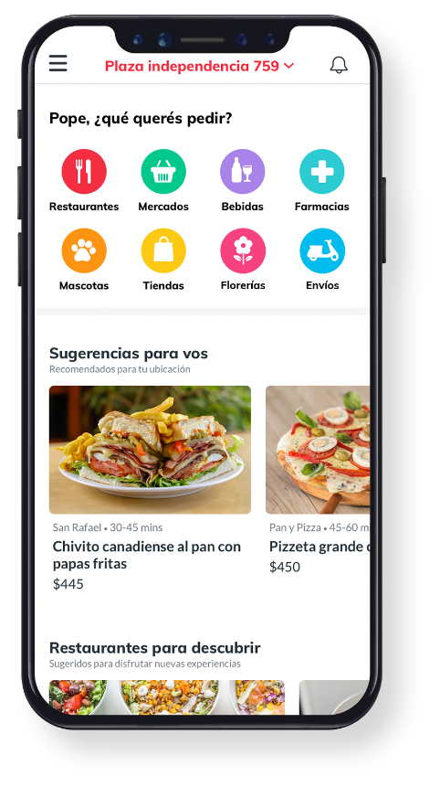
PedidosYa UI Kit
This led to a total and global inconsistency and a lack of time efficiency, both externally (users) and internally (developers, QA, user testing). From a user perspective, one could see the same element on one screen, and on the next, this element was different but fulfilled the same function. It also complicated and lengthened the work with the developers and the effort time (the designer created everything from scratch or copied and pasted components they had already designed, without knowing if another designer had already done it, or if it was already componentized). There was no consistency from the user perspective, the visual perspective, or the brand perspective. There was also no way to stay up-to-date across teams under the same rules and context. Nothing was right.
That's why I decided to lead the design and development of the "PedidosYa UI Kit and Design System." It was a rather ambitious but exciting project. My idea was for designers to design freely but within a common system for everyone, always under the same umbrella of consistency and adaptability. If a need arose, we would all be on the same page.
As Head of Design, I started by having a holistic overview of the entire company and its various departments. I organized global cross-transactional objectives and then focused on objectives or problems caused by each sector. In Product, in addition to highlighting some areas for improvement to streamline the way designers, squads, and tribes worked, I discovered that each designer worked with their own file(s) (Sketch), creating each element or symbol from scratch in each new iteration, screen, or user flow as a prototype.


Using the UI Kit
After defining, developing, and creating each symbol and component for the UI Kit library, the master Sketch file was saved on a server with no editing access except for certain key people responsible for maintaining and updating it. Each designer, for each new creation, must link to that library to keep everything up to date and import the necessary symbols, components, and screens to focus on their task with everything they need, updated and componentized.
We held formal weekly meetings with all the designers to iterate on new needs that arose, new issues, changes, updates, and/or removals of symbols that had become obsolete. All of them evaluate and agree on the next steps, which are implemented by the assigned key people (who edit the source file and synchronize it with all the files). When this urgent need arises, the designer requests an "express chapter" (as we call these unexpected and spur-of-the-moment meetings) where those who can at the time come together to resolve the issue and not hinder the designer's work. Then, in the formal meeting, the decision is reviewed and updated to see if it needs to be re-evaluated.
Design QA
I wanted the designers’ final work to stay true to what would actually be launched. I’m quite strict about maintaining consistency — from the job to be done and the user experience all the way to pixel perfection. That’s why, in addition to refining a methodology we might call ‘pairing-programming-designing’ (where designers worked side by side with developers), and reviewing details to change, improve, or iterate, we created a dedicated Design QA (Quality Assurance) stage.
One of the practices we implemented was that, when reaching the initial testing phase in the app (what we called ‘PedidosYa Demo’), which was essentially a first implemented version of what might later go to pre-prod (‘PedidosYa Night’), we assigned the release or design objective of one designer to a different designer who wasn’t deeply involved in that specific task. That way, they could compare the design brief, UX, and UI of the release with the actual experience in PedidosYa Demo and report any gaps or changes. Since the reviewing designer wasn’t directly focused on that objective during their sprint, their perspective remained more objective and unbiased — while still applying a detail-oriented designer’s eye.
Process and methodology
First, what we did with the entire Product design team was to conduct a review of all the files, screens, elements, and flows they'd been working on. At the same time, we investigated what was currently in production to identify the differences and dichotomies between the originally proposed idea and what emerged in the rollout. The idea was to see the problem before our eyes to understand the goal of unification.
With all this information in front of us, we decided to create a kind of affinity diagram to visualize the problems encountered and find common solutions. We then used card sorting to classify all the elements by category until we arrived at a logical taxonomy and were able to organize them so that the information architecture was coherent and understandable for the team. After all, they themselves were going to be the user personas for these components, and it had to be as user-friendly and simple as possible.
One of the many problems we encountered was that, due to the way we had previously worked, elements with the same functionality appeared even though they were visually different, so we unified them to make them consistent and a single piece.
I wanted to create an open, simple, usable, recognizable, collaborative, scalable, upgradeable, and robust system. I was clear that I wanted to use the atomic design methodology so that everything would start from the most basic element and then be used in components and, later, in screens.
Let's get to work
Personally, I'd never used Sketch before, so I had to learn how to use it quickly: watch videos, read tutorials, download plugins, research its potential (and evaluate whether it was the right corporate tool for us), learn its limitations and requirements, and see what the workflow should be like between designers, front-end developers, and mobile developers. Let's just say it was an intensive course, but it was worth it: I fell in love with Sketch despite some of its limitations.
The first thing I did was organize how to symbolize the elements: the main philosophy was to start from the smallest to the largest so that it followed the "inheritance" modus operandi (like CSS, SCSS, or SASS). That is, if I used a corporate color, that color would be a symbol that, by simply modifying it, would modify any element, component, or screen that used it. And, in turn, this would be synchronized and applied to the entire design team.
It wasn't an easy task at all: for each component, we had to define what symbols it should contain. We had to think of a screen as a tree: these trees can have many branches, which in turn have smaller branches and leaves. That is, a component can be composed of several symbols (elements), whose symbols are composed of other symbols, and so on. Let's say it was a long and complex branching process, but it was the way to do it in accordance with my philosophy. I knew the difficult part was the entire initial stage of designing and developing the UI Kit, but later, when designers used it, this would make everything easier, not to mention the efficiency of the effort.

A system
open
simple
usable
recognizable
collaborative
scalable
upgradeable
robust
We symbolize absolutely everything: corporate colors, text styles (titles, subtitles, headings, references, labels, tags, prices, alerts), buttons (CTAs), shapes, icons, illustrations, text fields, headers, lists, cards, modals, alerts, swimlanes, toasts, notifications, reviews, panels, tabs, splash, upsellings, navigation bar, search bar, and the list really goes on and on.
And all of this under a simple, easily accessible structure, since the idea is for the user to find the symbol they need simply and directly. The goal is to facilitate, not hinder.
Added to this was a significant complexity: the symbols had to be responsive and unique, so they had to be configured and designed for all device sizes (from an iPhone 5.5 to an iPhone 11, Android, iPad, etc.). In other words, we didn't want to make one symbol for an iPhone 5 and another for an iPhone 8, but rather one that could be reused for both devices. The designer had to be able to select the symbol and stretch it to the width of the device, ensuring it remained in the correct proportions. So for each symbol and component, we had to configure each proportion: what should remain fixed (width and/or height), what shouldn't, what should be dynamic, what should remain to the right, left, top, and/or bottom when stretched, what should be constrained, and what shouldn't.
We also had to keep in mind that there were icons and system components that we did have to customize so that the user felt like they were in the environment: we couldn't use the iPhone status bar on an Android, or use the Android 'share' icon on an iPhone.
Another issue I wanted to be firm about for ease of use was symbol substitution in a component. That is, a component should have a structure that allows for easy substitution of the symbols that comprise it. Let's suppose we have a bottom tab with four icons: the idea is that these icons are symbols and that the designer can select each one and replace it with another (obviously, the symbol should have the same size and proportions). In other words, my basic idea was to avoid the "detach symbol" as much as possible so as not to lose the update and synchronization of the base UI Kit.
A significant issue was component spacing, margins, and padding. We evaluated the different components and figured out how to ensure these spacings were respected without having to rely on the designer's memory or constantly refer to the documentation (since this was all defined in the Design System we designed in parallel). We discovered several of these issues and solved them as needed. A clear example is the buttons: we knew that the left and right padding had to be the exact same size at all times, and the same was true for the top and bottom, so we started using a Sketch plugin to configure this. The designer only had to write the button label, and it was created exactly as we defined it. And so we solved various measurements, margins, and gutters.


Abstract
Some time before ending my time at PedidosYa, I worked with Abstract and DeliveryHero (a German company that acquired PedidosYa) to obtain licenses and further improve the process of updating the UI Kit, flows, blueprints, and so on. This system had barely appeared, and I already found it extremely interesting. Simply put, Abstract is a software that versions Sketch files so you can create different branches (or file variations and updates), and then request a review from the person in charge (usually the lead designer). If they approve it, it is passed on to the master file so that it becomes the final, official version.
This system was being implemented when I left PedidosYa. I'm still in constant contact with my former team, and they tell me they still use it and that it made their daily operations much easier.

Design System
In parallel with the UI Kit, we created the PeYa Design System so that everything is documented.
The idea is that in this framework each element, component, part, screen and resource has the following information:
-
Technical data (colors, fonts, line spacing, padding)
-
Concept
-
Beginning
-
Attributes
-
Purpose of use
-
Use cases (how it can be used, how it cannot be used)
-
Borderline cases
-
Animations
-
Microinteractions
-
Elevation levels
-
Contextual examples
-
How it is categorized
-
What other components can it coexist with and which ones can it not?
-
How to find it in the UI Kit structure
-
Hundreds of other items
One of the many advantages we found in documenting this was that we linked Sketch to Zeroheight, so if a UI Kit component is updated, those changes are automatically updated in Zeroheight, where they are publicly available. This made the process much easier and smoother.
Conclusion
Both UI Kit and Design System were truly successful for the company and are still used daily to this day. Based on what we did with the design team, a parallel library was created, directly related to developers, with all the technical data for each element and component, with the same purpose: reuse, consistency, and streamline development times. And every time a component is updated, it's updated in every library so we're all working under the same umbrella.


